


Get On The List
Get the latest Men's Style Advice, Evergreen Guides, Shopping Tips, and Exclusive Deals From Today's Top Brands.

We independently evaluate all recommended products and services. Any products or services put forward appear in no particular order. if you click on links we provide, we may receive compensation.
So with men’s accessories out of the way, I think it’s time that we move on to something a bit more colorful. I’d say that probably half the e-mails that I receive from guys with questions about fashion tend to revolve around how to wear color correctly. Most of the time it’s in regard to an item that they’ve purchased and they’re unsure of what to pair it with but occasionally it’s the simple question of “How does color work?”. And it’s a fair one to ask.
It seems that as males we have an innate disposition compared to our female counterparts when it comes to color. It scares us. Confuses us. Gives us that dizzy feeling not unlike vertigo. This often results in the modern day man we see who prefers to stick to neutral tones like black, white and grey which, let’s be honest… is pretty boring. But luckily, you don’t need to be a woman to understand how to wear color, you just need to understand the color wheel.
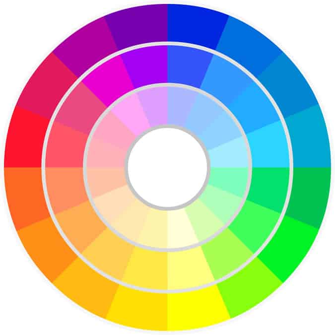
When you look at the color wheel you can see twelve main colors ranging from red to violet, green to yellow, blue all the way back to red. These are the basic colors that can be referred to as hues. If you add white or black to these then they will change in hue yet again; for example violet and white will make lavender while black with purple will make plum.
By making these adjustments you can pretty much come up with any color you want. But what’s really important is understanding the position of each color on the wheel because how close or far away they are is what makes them easy or difficult to co-ordinate.
As I said, where colors sit on the wheel will let you know if they go together:
It’s also important to bear mind a few other rules too. When it comes to light colors, don’t pair them together too often, they tend to have an Easter Egg effect. It’s best to anchor light colors with dark grey or black; if the color is one or two steps away from being white then it’s best to stick with a charcoal grey. The important thing to remember is that dark colors (like burgundy and navy) pair better with vivid (not light) colors because the dark tends to overpower the light.
Finally, don’t forget your neutrals! These colors will pair well with each other and any other color in the wheel. So black, grey and white are always great colors to have to hand. Other neutrals include brown, tans and khakis – these match well with all colors in the wheel too but not other neutrals because they already have enough grey in them as it is. It creates a sort of muddy look.
So there you have it guys, a guide on how to use color. If you’re ever in doubt, pick a color and vary the tint and shade. Anyone who’s seen picture of Cary Grant in a navy suit, blue shirt and dark blue tie will agreed how good one color can look. But other than that, play around, experiment and have fun with color!
Matt graduated from Leeds University in 2009 and is currently studying for an MA in Multi-media Journalism at Bournemouth University. He is in charge of the Men’s Fashion Basics section which provides you with a step by step guide to becoming a stylish individual in any situation.

We independently evaluate all recommended products and services. Any products or services put forward appear in no particular order. if you click on links we provide, we may receive compensation.
So with men’s accessories out of the way, I think it’s time that we move on to something a bit more colorful. I’d say that probably half the e-mails that I receive from guys with questions about fashion tend to revolve around how to wear color correctly. Most of the time it’s in regard to an item that they’ve purchased and they’re unsure of what to pair it with but occasionally it’s the simple question of “How does color work?”. And it’s a fair one to ask.
It seems that as males we have an innate disposition compared to our female counterparts when it comes to color. It scares us. Confuses us. Gives us that dizzy feeling not unlike vertigo. This often results in the modern day man we see who prefers to stick to neutral tones like black, white and grey which, let’s be honest… is pretty boring. But luckily, you don’t need to be a woman to understand how to wear color, you just need to understand the color wheel.
When you look at the color wheel you can see twelve main colors ranging from red to violet, green to yellow, blue all the way back to red. These are the basic colors that can be referred to as hues. If you add white or black to these then they will change in hue yet again; for example violet and white will make lavender while black with purple will make plum.
By making these adjustments you can pretty much come up with any color you want. But what’s really important is understanding the position of each color on the wheel because how close or far away they are is what makes them easy or difficult to co-ordinate.
As I said, where colors sit on the wheel will let you know if they go together:
It’s also important to bear mind a few other rules too. When it comes to light colors, don’t pair them together too often, they tend to have an Easter Egg effect. It’s best to anchor light colors with dark grey or black; if the color is one or two steps away from being white then it’s best to stick with a charcoal grey. The important thing to remember is that dark colors (like burgundy and navy) pair better with vivid (not light) colors because the dark tends to overpower the light.
Finally, don’t forget your neutrals! These colors will pair well with each other and any other color in the wheel. So black, grey and white are always great colors to have to hand. Other neutrals include brown, tans and khakis – these match well with all colors in the wheel too but not other neutrals because they already have enough grey in them as it is. It creates a sort of muddy look.
So there you have it guys, a guide on how to use color. If you’re ever in doubt, pick a color and vary the tint and shade. Anyone who’s seen picture of Cary Grant in a navy suit, blue shirt and dark blue tie will agreed how good one color can look. But other than that, play around, experiment and have fun with color!
Matt graduated from Leeds University in 2009 and is currently studying for an MA in Multi-media Journalism at Bournemouth University. He is in charge of the Men’s Fashion Basics section which provides you with a step by step guide to becoming a stylish individual in any situation.


Get the latest Men's Style Advice, Evergreen Guides, Shopping Tips, and Exclusive Deals From Today's Top Brands.
We respect your privacy. We won't spam you.
Get the latest Men's Style Advice, Evergreen Guides, Shopping Tips, and Exclusive Deals From Today's Top Brands.
We respect your privacy. We won't spam you.