FashionBeans Archives
Here at FashionBeans, we strive to bring you the very latest in men’s fashion, style, and grooming, which means that due to the fast-paced nature of the industry, we sometimes have to archive old or out-of-date content.
So, rather than serve you an article that is no longer relevant, we’ve collated all our latest up-to-the-minute feature content below, to help ensure your personal style and wardrobe remain
Men's Fashion & Style

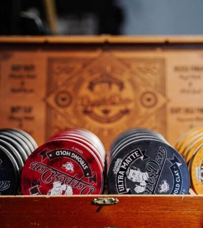
Men's Grooming


Men's Hairstyles


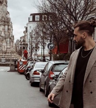

Street Style
Street Style
Street Style
Street Style
Street Style
Street Style
Street Style
Street Style
Street Style
Street Style
Street Style
Street Style
Street Style
Street Style
Street Style
Street Style
Street Style
Street Style
Street Style
Street Style
Street Style
Street Style
Street Style
Street Style
Street Style
Street Style
Street Style
Street Style
Street Style
Street Style
Street Style
Street Style
Street Style
Street Style
Street Style
Street Style
Street Style
Street Style
Street Style
Street Style
Street Style
Street Style
Street Style
Street Style
Street Style
Street Style
Street Style
Street Style
Street Style
Street Style
Street Style
Street Style
Street Style
Street Style
Street Style
Street Style
Street Style
Street Style
Street Style
Street Style
Street Style
Street Style
Street Style
Street Style
Street Style
Street Style
Street Style
Street Style
Street Style
Street Style
Street Style
Street Style
Street Style
Street Style
Street Style
Street Style
Street Style
Street Style
Street Style
Street Style
Street Style
Street Style
Street Style
Street Style
Street Style
Street Style
Street Style
Street Style
Street Style
Street Style
Street Style
Street Style
Street Style
Street Style
Street Style
Street Style
Street Style
Street Style
Street Style
Street Style
Street Style
Street Style
Street Style
Street Style
Street Style
Street Style
Street Style
Street Style
Street Style
Street Style
Street Style
Street Style
Street Style
Street Style
Street Style
Street Style
Street Style
Street Style
Street Style
Street Style
Street Style
Street Style
Street Style
Street Style
Street Style
Street Style
Street Style
Street Style
Street Style
Street Style
Street Style
Street Style
Street Style
Street Style
Street Style
Street Style
Street Style
Street Style
Street Style
Street Style
Street Style
Street Style
Street Style
Street Style
Street Style
Street Style
Street Style
Street Style
Street Style
Street Style
Street Style
Street Style
Street Style
Street Style
Street Style
Street Style
Street Style
Street Style
Street Style
Street Style
Street Style
Street Style
Street Style
Street Style
Street Style
Street Style
Street Style
Street Style
Street Style
Street Style
Street Style
Street Style
Street Style
Street Style
Street Style
Street Style
Street Style
Street Style
Street Style
Street Style
Street Style
Street Style
Street Style
Street Style
Street Style
Street Style
Street Style
Street Style
Street Style
Street Style
Street Style
Street Style
Street Style
Street Style
Street Style
Street Style
Street Style
Street Style
Street Style
Street Style
Street Style
Street Style
Street Style
Street Style
Street Style
Street Style
Street Style
Street Style
Street Style
Street Style
Street Style
Street Style
Street Style
Street Style
Street Style
Street Style
Street Style
Street Style
Street Style
Street Style
Street Style
Street Style
Street Style
Street Style
Street Style
Street Style
Street Style
Street Style
Street Style
Street Style
Street Style
Street Style
Street Style
Street Style
Street Style
Street Style
Street Style
Street Style
Street Style
Street Style
Street Style
Street Style
Street Style
Street Style
Street Style
Street Style
Street Style
Street Style
Street Style
Street Style
Street Style
Street Style
Street Style
Street Style
Street Style
Street Style
Street Style
Street Style
Street Style
Street Style
Street Style
Street Style
Street Style
Street Style
Street Style
Street Style
Street Style
Street Style
Street Style
Street Style
Street Style
Street Style
Street Style
Street Style
Street Style
Street Style
Street Style
Street Style
Street Style
Street Style
Street Style
Street Style
Street Style
Street Style
Street Style
Street Style
Street Style
Street Style
Street Style
Street Style
Street Style
Street Style
Street Style
Street Style
Street Style
Street Style
Street Style
Street Style
Street Style
Street Style
Street Style
Street Style
Street Style
Street Style
Street Style
Street Style
Street Style
Street Style
Street Style
Street Style
Street Style
Street Style
Street Style
Street Style
Street Style
Street Style
Street Style
Street Style
Street Style
Street Style
Street Style
Street Style
Street Style
Street Style
Street Style
Street Style
Street Style
Street Style
Street Style
Street Style
Street Style
Street Style
Street Style
Street Style
Street Style
Street Style
Street Style
Street Style
Street Style
Street Style
Street Style
Street Style
Street Style
Street Style
Street Style
Street Style
Street Style
Street Style
Street Style
Street Style
Street Style
Street Style
Street Style
Street Style
Street Style
Street Style
Street Style
Street Style
Street Style
Street Style
Street Style
Street Style
Street Style
Street Style
Street Style
Street Style
Street Style
Street Style
Street Style
Street Style
Street Style
Street Style
Street Style
Street Style
Street Style
Street Style
Street Style
Street Style
Street Style
Street Style
Street Style
Street Style
Street Style
Street Style
Street Style
Street Style
Street Style
Street Style
Street Style
Street Style
Street Style
Street Style
Street Style
Street Style
Street Style
Street Style
Street Style
Street Style
Street Style
Street Style
Street Style
Street Style
Street Style
Street Style
Street Style
Street Style
Street Style
Street Style
Street Style
Street Style
Street Style
Street Style
Street Style
Street Style
Street Style
Street Style
Street Style
Street Style
Street Style
Street Style
Street Style
Street Style
Street Style
Street Style
Street Style
Street Style
Street Style
Street Style
Street Style
Street Style
Street Style
Street Style
Street Style
Street Style
Street Style
Street Style
Street Style
Street Style
Street Style
Street Style
Street Style
Street Style
Street Style
Street Style
Street Style
Street Style
Street Style
Street Style
Street Style
Street Style
Street Style
Street Style
Street Style
Street Style
Street Style
Street Style
Street Style
Street Style
Street Style
Street Style
Street Style
Street Style
Street Style
Street Style
Street Style
Street Style
Street Style
Street Style
Street Style
Street Style
Street Style
Street Style
Street Style
Street Style
Street Style
Street Style
Street Style
Street Style
Street Style
Street Style
Street Style
Street Style
Street Style
Street Style
Street Style
Street Style
Street Style
Street Style
Street Style
Street Style
Street Style
Street Style
Street Style
Street Style
Street Style
Street Style
Street Style
Street Style
Street Style
Street Style
Street Style
Street Style
Street Style
Street Style
Street Style
Street Style
Street Style
Street Style
Street Style
Street Style
Street Style
Street Style
Street Style
Street Style
Street Style
Street Style
Street Style
Street Style
Street Style
Street Style
Street Style
Street Style
Street Style
Street Style
Street Style
Street Style
Street Style
Street Style
Street Style
Street Style
Street Style
Street Style
Street Style
Street Style
Street Style
Street Style
Street Style
Street Style
Street Style
Street Style
Street Style
Street Style
Street Style
Street Style
Street Style
Street Style
Street Style
Street Style
Street Style
Street Style
Street Style
Street Style
Street Style
Street Style
Street Style
Street Style
Street Style
Street Style
Street Style
Street Style
Street Style
Street Style
Street Style
Street Style
Street Style
Street Style
Street Style
Street Style
Street Style
Street Style
Street Style
Street Style
Street Style
Street Style
Street Style
Street Style
Street Style
Street Style
Street Style
Street Style
Street Style
Street Style
Street Style
Street Style
Street Style
Street Style
Street Style
Street Style
Street Style
Street Style
Street Style
Street Style
Street Style
Street Style
Street Style
Street Style
Street Style
Street Style
Street Style
Street Style
Street Style
Street Style
Street Style
Street Style
Street Style
Street Style
Street Style
Street Style
Street Style
Street Style
Street Style
Street Style
Street Style
Street Style
Street Style
Street Style
Street Style
Street Style
Street Style
Street Style
Street Style
Street Style
Street Style
Street Style
Street Style
Street Style
Street Style
Street Style
Street Style
Street Style
Street Style
Street Style
Street Style
Street Style
Street Style
Street Style
Street Style
Street Style
Street Style
Street Style
Street Style
Street Style
Street Style
Street Style
Street Style
Street Style
Street Style
Street Style
Street Style
Street Style
Street Style
Street Style
Street Style
Street Style
Street Style
Street Style
Street Style
Street Style
Street Style
Street Style
Street Style
Street Style
Street Style
Street Style
Street Style
Street Style
Street Style
Street Style
Street Style
Street Style
Street Style
Street Style
Street Style
Street Style
Street Style
Street Style
Street Style
Street Style
Street Style
Street Style
Street Style
Street Style
Street Style
Street Style
Street Style
Street Style
Street Style
Street Style
Street Style
Street Style
Street Style
Street Style
Street Style
Street Style
Street Style
Street Style
Street Style
Street Style
Street Style
Street Style
Street Style
Street Style
Street Style
Street Style
Street Style
Street Style
Street Style
Street Style
Street Style
Street Style
Street Style
Street Style
Street Style
Street Style
Street Style
Street Style
Street Style
Street Style
Street Style
Street Style
Street Style
Street Style
Street Style
Street Style
Street Style
Street Style
Street Style
Street Style

